 Email is a key piece of any fundraiser’s promotional campaign. In recent weeks, we’ve discussed how to write event emails that impact as many people as possible: writing compelling “Save the date” invitations; strategic best practices for emails leading up to the event; segmenting your donor database to increase participation; and timing emails when they’re most likely to be read.
The final piece: crafting emails that are responsive on mobile devices.
“Responsive design” refers to content that is easy for anyone to view, scan and digest on any device: laptop, smartphone, tablet and so forth. When creating nonprofit event emails, this is a critical but often overlooked consideration.
These days, not everyone is reading your email on a desktop computer. More than half of all email in the U.S. – a full 65 percent – is now being accessed via mobile devices. (In fact, nearly 4 out of every 10 visits to Winspire News is from a mobile device!)
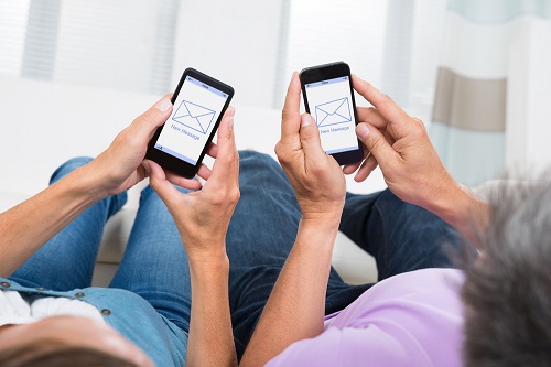
However, if you start designing with mobile in mind, you could potentially double your audience, attendees and ultimately event revenue.
Read on to see how you can capture 100 percent of your audience by writing event promotional emails that look great on any device. (Best of all, these tips work great for most emails you send year-round.)
Select an Email Service Provider
First things first: you’ll need to pick an email service provider. Many nonprofits use tools like Outlook that are simple but don’t offer mobile responsive design (and also lack analytic tools; the ability to schedule emails in advance; a lower likelihood of being marked as spam; professional templates…you get the idea.).
Do your research to find one that meets your needs and fits your budget. You’ll find free services that limit the number of subscribers you can have (like MailChimp) and services with fancy features that cost hundreds of dollars (like Constant Contact). Choose one that makes sense for your organization.
Email Service Provider Discounts for Nonprofits
Expert Tip: Many top-rated email service providers offer major discounts on their services for nonprofits. Check out a few of the best offers we found exlusively for charities and nonprofit orgs (current as of May 2016):
- AWeber – 3 months free for new accounts, followed by a 25% discount
- Benchmark Email – 25% off
- Constant Contact – 20% off with 6 months prepaid, or 30% off with 1 year prepaid
- Emma, Inc. – 20% off
- GetResponse – 50% off
- MailChimp – 15% off, plus 10% off if you sign up for 2-step security verification
- Vertical Response – Up to 10,000 emails per month free, plus 15% off monthly plans
Whichever email management software you choose, look for analytic tools that give you a better understanding of your audience’s interests and reading patterns. This will show you not only how many recipients open the email, whether they forward it and which links they click on, but most importantly for today’s post, what type of device they use to read it. When you see how many recipients are reading your emails on mobile devices, you’ll be glad you optimized your content for mobile viewing.
Learn the basics of mobile design
 Click here to watch a video tutorial on creating promotional emails using Constant Contact (and similar email service providers)
The next step is to learn whether your email service provider offers templates and builds for mobile compatibility. Many do, fortunately, which is a huge time-saver.
Here are 4 of the most important elements of mobile-friendly emails:
- Single column
- Short subject lines
- Succinct, scannable copy
- Large font size
Let’s take a closer look at each of these “mobile must-do”s.
Get the most out of your email campaigns! Click here to download the free eBook, “Beginner’s Guide to Email Event Promotion,” with bonus content calendar to help plan and organize efforts.
{{cta(‘661274c0-1d2e-4806-a547-596f67dbe59d’,’justifycenter’)}}
 Mobile Must-do #1: Single Column
However, when designing event emails for maximum mobile readership and engagement, it’s best to keep things simple. Too many content blocks or columns can look great on a desktop but get squished, stretched and moved around on mobile. Save the intricate details for the annual report, website or monthly newsletter.
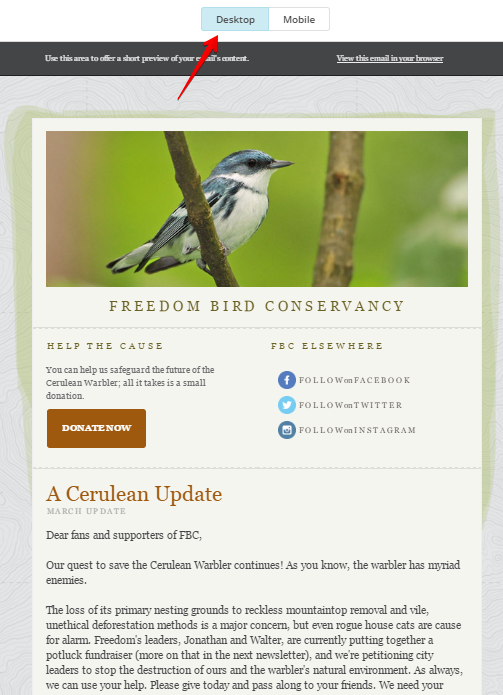
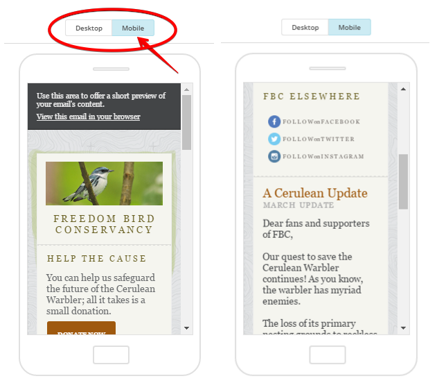
Fortunately, email service providers make it easy to preview how emails will look to mobile readers. For example, let’s look at MailChimp, which offers dozens of pre-made invitation templates and an easy interface to toggle the email view between both desktop and mobile.
Check out how this email looks in desktop…
Now see how all the content translates and adjusts to mobile (and how easy it is to switch to mobile preview mode):
The entire body of the email is written in one column, which drastically cuts down on any formatting issues. Even better: The email service provider automatically condensed and rejigged the columns, text size and image to fit a mobile device.
 Mobile Must-do #2: Short subject lines
On a desktop, the subject lines in Gmail can fit about 60 characters:
This sentence could fit comfortably, but not much longer than this.
But on a mobile device, subject lines are about half that, at 25 to 30 characters:
Only this much of the sentence fits.
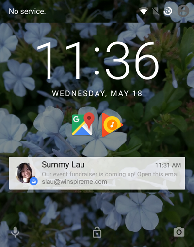
Readers’ first impressions of your message may also be a brief snippet that appears as a push notification on their phone or tablet (pictured right), truncating the message significantly:
I suggest writing out your entire ideal subject line first, then paring it down. Get the content right first, then the delivery. This ensures readers know what to expect when they open your email (and are less likely to mark your message as spam).
To get readers to open your message, the content of the subject line (and the email itself) is even more important than the length. Having big-ticket nonprofit auction items to promote makes it much easier to come up with compelling subject lines.
Begin the subject line with the most important and exciting part of your message, where it’s most likely to be seen. Try enticing readers by starting with “Sneak Peek!” or “Bid on Your Dream Trip!”. Your audience will feel like exclusive VIPs and look forward to your event, plus enjoy reading about the incredible items you’ve procured.
{{cta(‘7199f670-e85c-4b82-88c8-5387edec6821′,’justifycenter’)}}
 Mobile Must-do #3: Succinct, scannable copy
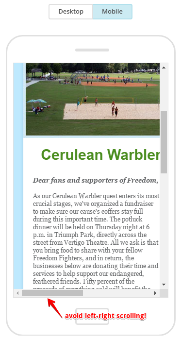
Take a look at this non-mobile optimized email (pictured left).
One long paragraph is difficult to read and unlikely to capture the attention of multitasking readers.
Fortunately, the solution is simple. Break up your email by writing short chunks of content that are easy to digest and scan while scrolling through the message. Utilize bullet points, one-sentence paragraphs, text formatting and big, colorful call-to-action buttons (like a big “Buy Tickets” button) to guide your reader toward the desired action.
Make it easy for readers to know what to do and when to do it, at a glance.
Mobile Must-do #4: Large font size
This example also shows how difficult it can be to read an email when font sizes are too small. To ensure readability on a small screen, stick to a 12 to 14-pt. font size that’s readable in both desktop and mobile formats.
Finally, this non-optimized email also shows the importance of sticking to one column and building your email long rather than wide. Readers have to scroll left and right to read the whole message, which is a big no-no –and surefire way to have at least half the message go unread.
Test the email
Finally, the best way to determine whether an email is compatible with mobile is to test it. As we’ve seen, most email service providers allow you to preview in mobile from your desktop, or even push to a mobile app for easy viewing from your device.
Is the email easy to read and navigate? Is your content compelling and succinct? Is your eye naturally drawn to the call to action? Are the visuals clear, logical and consistent with the rest of your promotional materials? If you answer “no” to any of these questions, make time for some editing and reformatting. Once the answer is yes, go ahead and hit “send” with confidence that your event is reaching a wider audience than ever before.
For more email expertise, check out MailMunch’s list of 12 Email Marketing Influencers to Follow in 2018.
{{cta(‘2083c6a1-80f9-43e5-ba7f-2157684db5d1′,’justifycenter’)}}

