Can you believe there’s just one week until Thanksgiving? With over half of nonprofits receiving the majority of their contributions between October and December, it’s no wonder development departments across North America are turning their focus to year-end giving campaigns.
The first milestone is Giving Tuesday, a global celebration of philanthropy on the Tuesday after Thanksgiving. This year it will take place on November 29, 2016.
As discussed in our recent post, “4 Quick Tips to Raise Money on #GivingTuesday,” ideally you’ve already been in contact with donors to raise awareness about this day.
If so, you’re in great shape to capitalize on this fundraising opportunity. If not, rest assured it’s not too late to join in the fun.
Read on for concrete tips and 9 real-life examples of landing pages that effectively capture year-end gifts.
Build a branded donation landing page
First, what is a landing page? It’s a distinct, standalone web page built for one objective. Landing pages typically contain forms for capturing information, like email addresses for newsletter subscriptions or, for the purposes of this post, making a donation.
Here are several best practices of building a branded Giving Tuesday page, and they apply to any donation page year-round.
1. Urgent Headline
Right from the start, define the mission and goal of the campaign.
Create a snappy tagline to explain your mission. According to web analytics platform Kissmetrics, people tend to read only the first 3 words and last 3 words of a headline when scanning. So you want to keep titles as short as possible.=
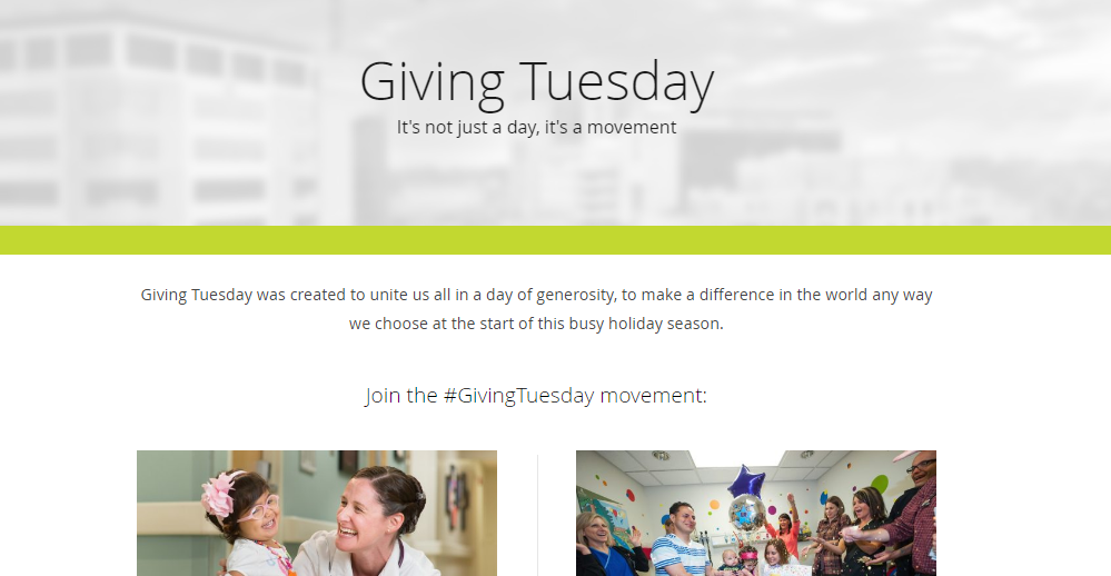
Check out this example from St. Jude Children’s Research Hospital‘s #GivingTuesday landing page.
The large headline is placed front and center. It can’t be missed. The description also emphasizes the global nature of the day and why generosity is so important now.
2. Demonstrate Impact
Donors love knowing the impact of their dollars, so it’s important to delineate how resources will be used.
In this example, #GivingTuesday Charlotte shows exactly what causes and area nonprofits benefit from participation.

As you already know, it’s also very helpful to try and secure a matching grant for year-end gifts.
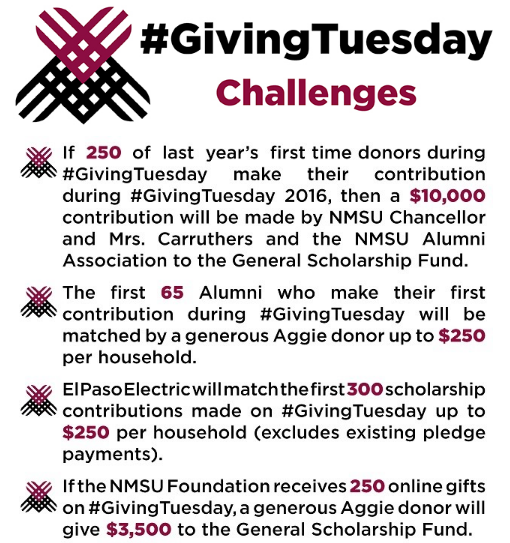
Take a look at this example from New Mexico State University.
Their Giving Tuesday graphic outlines matching pledges from various scholarship funds and donors. Supporters know the impact of their gifts will be doubled if they give today! That sense of urgency and immediacy is the surest way to sway on-the-fence gifts.
3. Pre-set Increments
The key to fundraising success: Make donation as easy as possible.
One easy way to do this is providing pre-set donation increments.
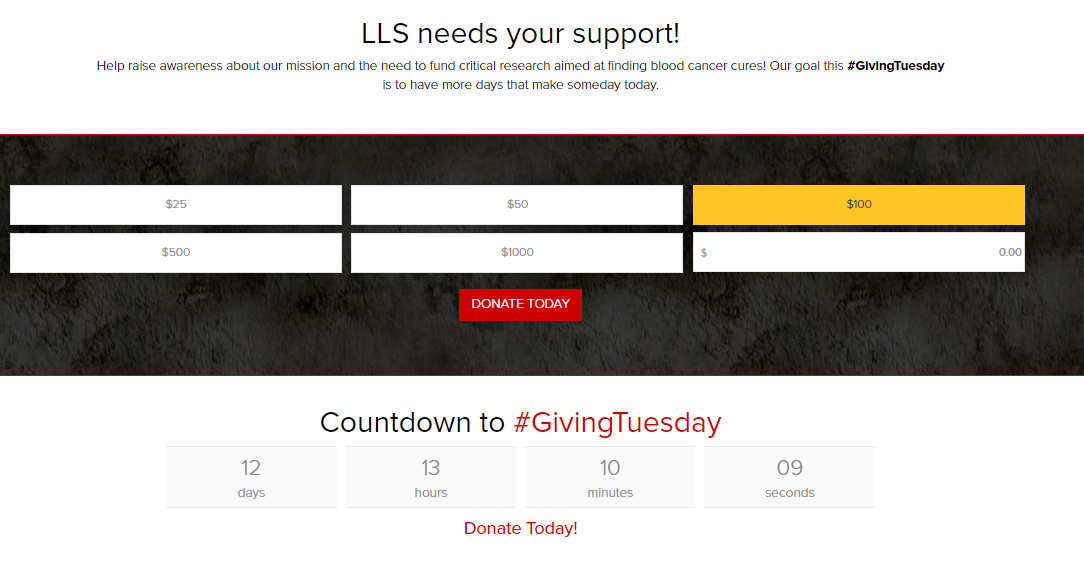
See this example from the Leukemia & Lymphoma Society.
Their landing page is incredibly effective. The multiple choice style significantly cuts down on visitor “analysis paralysis”. They’ve offered default choices of support ranging from $1000 to $25, plus a space for customized amounts, ensuring people of all giving capacities can participate.
(Also helpful: They included a countdown to Giving Tuesday. The occasion is special and something to be excited about!)
Go through the donation form and remove any unnecessary “data collection” questions you can. Any step you can eliminate between the idea of support and actually making the gift, will pay significant returns to your bottom line.
4. Simple Design
Make the call to action (CTA) of donation the centerpiece of the page. This separates Giving Tuesday and year-end giving campaigns as special, exclusive and limited-time events.
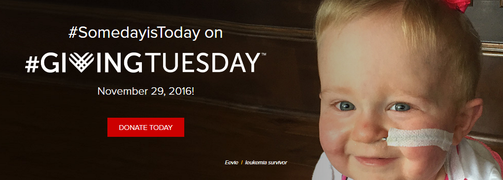
Again let’s take a look at the landing page from the Leukemia & Lymphoma Society.
The tagline, #SomedayisToday, is big, bold and clearly the center of attention.
The “Donate Today” button is also a primary focal point. Plus, it’s red; third-party traffic-driving service AddThis reports using warm colors (reds, oranges and yellows) inspires action.
Finally, the page features a striking image of one of their patients, a baby girl. Good images to use on landing pages focus on one or two subjects, with very little clutter or crowds in the background.
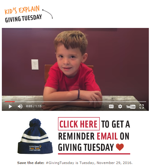
You might also embed a short video onto the site, like this great example from Volunteer New York:
5. Mobile Optimized
Many donors will be looking at your site through their phones, so you want your landing page to cater to mobile visitors. Having to zoom in to read your text or find the donation link is a no-no.
This is another bonus of keeping your landing page simple.
Check out this example from World Vision.
This simple page renders perfectly onto a mobile phone. The “Give Now” button is clearly the focal point of the campaign, and they used complementary colors (orange vs. blue) – a proven tactic to draw the eye to a call-to-action.
While they don’t have donation increments visible in the form, in this case it keeps the form as straightforwad as possible, so that’s certainly up to your discretion.
Giving on this page feels impactful, joyful, simple.
Most popular webpage builders like Weebly, WordPress and Kintera Sphere have drag-and-drop modules that automatically resize on mobile. Preview your site on a phone and tablet and run through the donor experience. If you have trouble reading the text, visitors will too, so adjust your style sheet or contact a webmaster for help before the big day.
6. Set as the “homepage” on Giving Tuesday
Once you’ve got your landing page all set up, it’s ready to go live!
Many nonprofits choose to publish the Giving Tuesday donation page and have it available before the actual date. Then, on the day of, have the homepage automatically redirect to the Giving Tuesday page so it’s the first thing visitors see.
Anyone who visits your site on Giving Tuesday or even in December most likely wants to donate, so make it as easy as possible right away.
Promote on Social Media
In the post “9 Simple Steps to Promote Auction Items on Facebook and Twitter,” we established that social media is a simple, effective and free method of promotion.
To promote #GivingTuesday, post a simple graphic on your personal and organization’s social media pages (Facebook, Twitter, Instagram) sometime between Thanksgiving weekend through Monday.
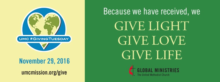
See this example fromUnited Methodist Church.
Simple, inspiring and easy to participate.
You might include a caption like “Tired of all the consumption around the holidays? #GivingTuesday is your chance to give back” and a link to your landing page.
Be sure to use the hashtag #GivingTuesday so your post will pop up first when friends and followers click on the trending term.

The eye-catching graphic expresses appreciation for supporters even before gifts are made.
Giving Tuesday would also be the perfect day to call major donors. Of course you want to invite them to participate in the day’s campaign, but more importantly, thank them for their faithful support.
Finally, a few days after the campaign has ended, announce the totals on the landing page, social media and your next email newsletter. This tends to give December donations a big headstart.
What strategies have you found effectively spur year-end giving? Let us know in the comments below!
{{cta(‘f82a5467-7b49-46ae-9e35-96b6d29291a8′,’justifycenter’)}}

